
Emotional Power of Colors
Color psychology, an intricate and fascinating field of study, explores into the deep impact that colors have on human emotions, behaviors, and mental processes. This interdisciplinary land draws insights from psychology, neuroscience, marketing, design, and cultural studies to untie the complex relationship between color and the human psyche.
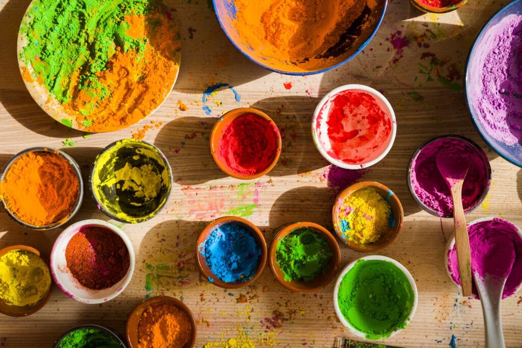
To understand color psychology, one must explore the unique emotional and psychological associations attributed to various colors. Each color carries its own set of meanings and can evoke specific feelings, making them powerful tools in a range of situations, from design and branding to marketing and daily life.
Red:
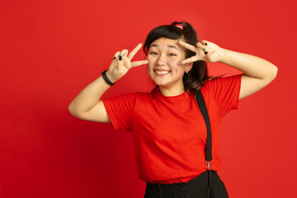
The color red is a complex color that often provokes strong emotional responses. It is commonly related with strong feelings such as passion, love, and desire. The vibrancy of red makes it a popular choice to convey energy and power, particularly in contexts where dynamism and assertiveness are desired. Red is often intentionally used in branding to capture attention and stimulate action. However, the flip side of red is its potential to evoke feelings of anger, danger, or urgency, underlining its divided nature.
In certain contexts, red can be associated with warmth and comfort. In interior design, it is utilized to create spaces that feel cozy and inviting. On the other hand, in warning signs and signals, red is a universal indicator of caution and potential danger. The nuanced use of red in various applications showcases its versatility in communicating a spectrum of emotions and messages.
Blue:
Blue is a color which is often related with the vastness of the sky and the calming presence of water. It is frequently linked to a sense of calmness, serenity, and stability. It has a soothing effect on the human mind, promoting feelings of trust and reliability. Blue is often employed in environments where a sense of serenity is sought, such as healthcare settings or corporate offices. Color blue has soothing effect. It is used in bedrooms and spaces where relaxation is important.
However, the psychological impact of blue is not limited to tranquility. Certain shades of blue can evoke feelings of sadness or cold detachment, showcasing the various nature of color psychology. Darker blues may be associated with depth and professionalism, while lighter blues can convey a more playful and open atmosphere. The versatility of blue allows it to adapt to a range of emotions and settings.
Yellow:
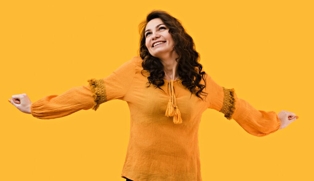
Yellow, a vibrant and attention-grabbing color, is synonymous with happiness, warmth, and positivity. It has the ability to uplift moods and convey a sense of optimism. The energetic nature of yellow makes it a popular choice in branding and marketing to create a lively and dynamic impression. Yellow is often associated with the sun, adding to its positive connotations.
However, an excessive use of yellow can be overwhelming and may trigger feelings of anxiety in certain individuals. Striking the right balance is crucial when incorporating yellow into design or branding to harness its positive qualities without overwhelming the viewer. Understanding the cultural context is also essential, as yellow may hold different meanings in various societies.
Green:
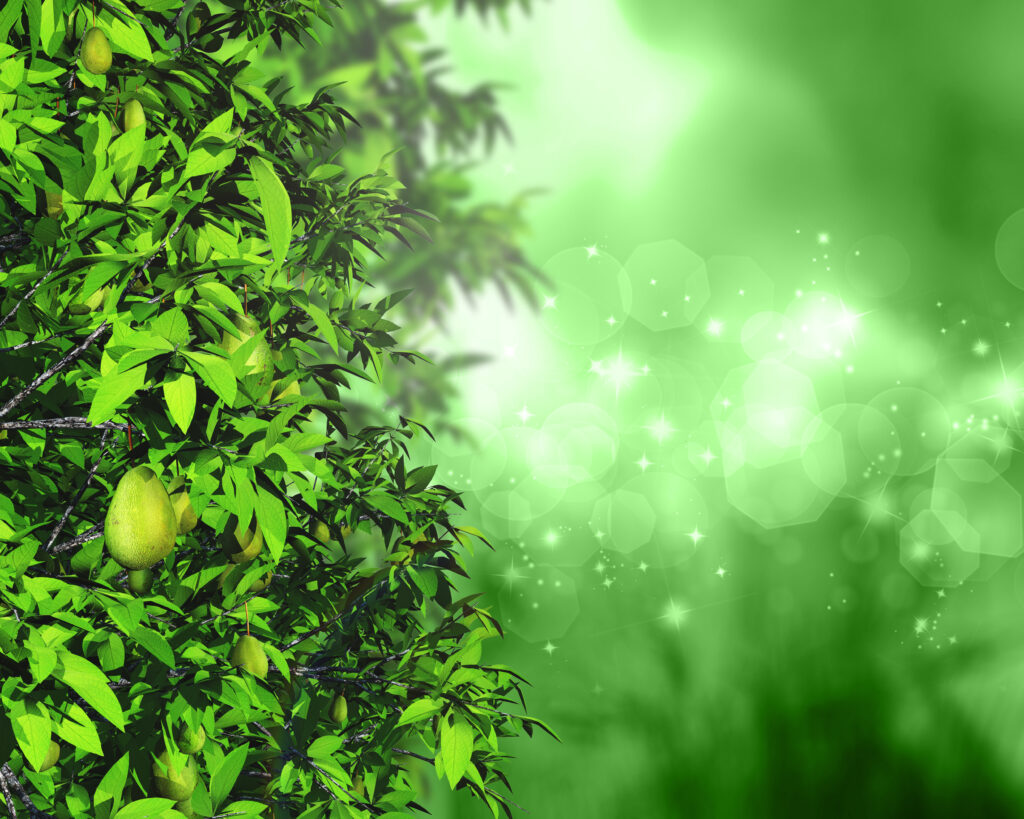
Color green is associated with nature, growth, and renewal. It carries suggestions of harmony and balance. It is a color that promotes a sense of calm and relaxation, making it suitable for environments where a connection with nature is desired. Green is often used in interior design to create spaces that feel refreshing and stimulating.
Color green has its calming influence. It is also frequently linked to environmental awareness and sustainability. In branding and marketing, businesses seeking to convey a commitment to eco-friendliness may incorporate various shades of green into their visual identity. The association with growth and renewal makes green a powerful symbol in conveying messages of progress and positive change.
Purple:
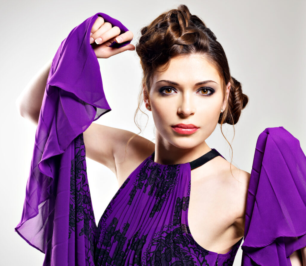
Purple, a color often associated with royalty, luxury, and creativity, carries a sense of opulence and uniqueness. Its historical association with royal power has contributed to its perception as a sophisticated and regal color. Purple is often chosen to convey a sense of exclusivity and allure in design and branding.
The color also carries a certain degree of mystery and intrigue, making it a popular choice for products or services that aim to stand out. In artistic and creative fields, purple is often used to evoke a sense of imagination and innovation. However, the psychological impact of purple can vary depending on its shade, with darker purples conveying a more serious and mysterious tone.
Orange:
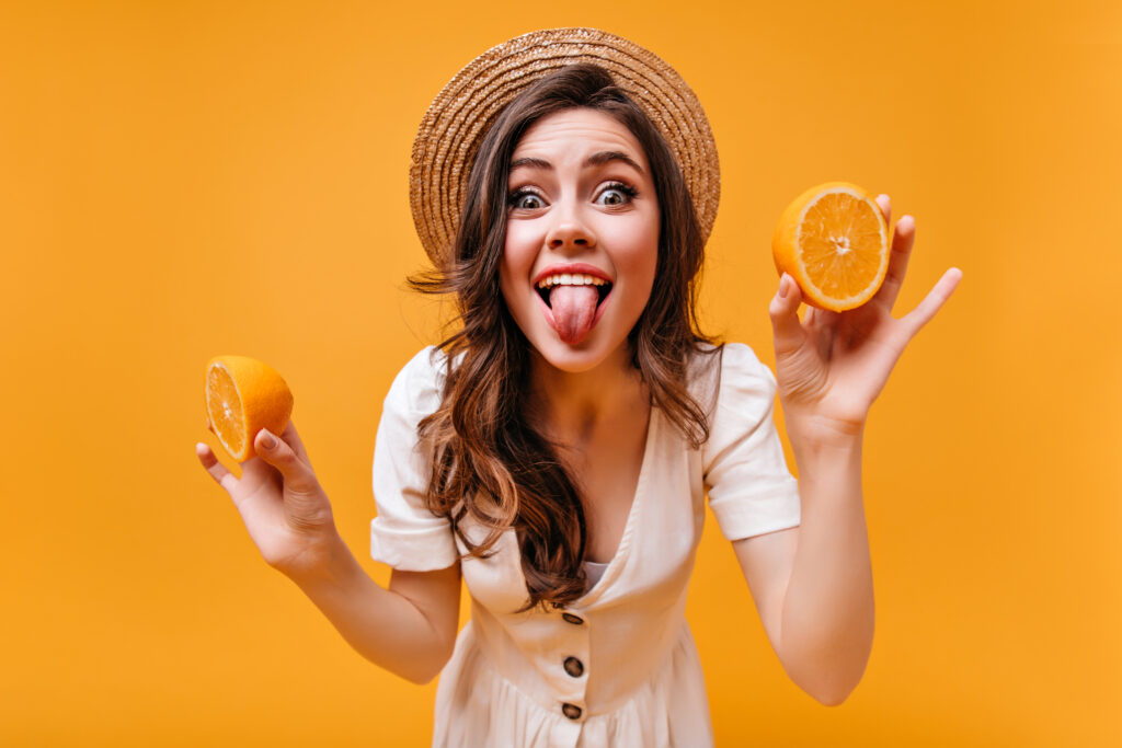
Orange, a vibrant and energetic color, radiates enthusiasm, warmth, and creativity. It demands attention and is often associated with friendliness. Businesses and brands seeking to convey a sense of approachability and innovation may incorporate orange into their visual identity. The energetic nature of orange makes it a popular choice in industries where a dynamic and lively image is desired.
However, like yellow, an excess of orange can be perceived as overly stimulating. Striking a balance and considering the context in which orange is used are essential to effectively leverage its positive attributes. Understanding the cultural associations with orange is also crucial, as it may carry different meanings in diverse societies.
Black:
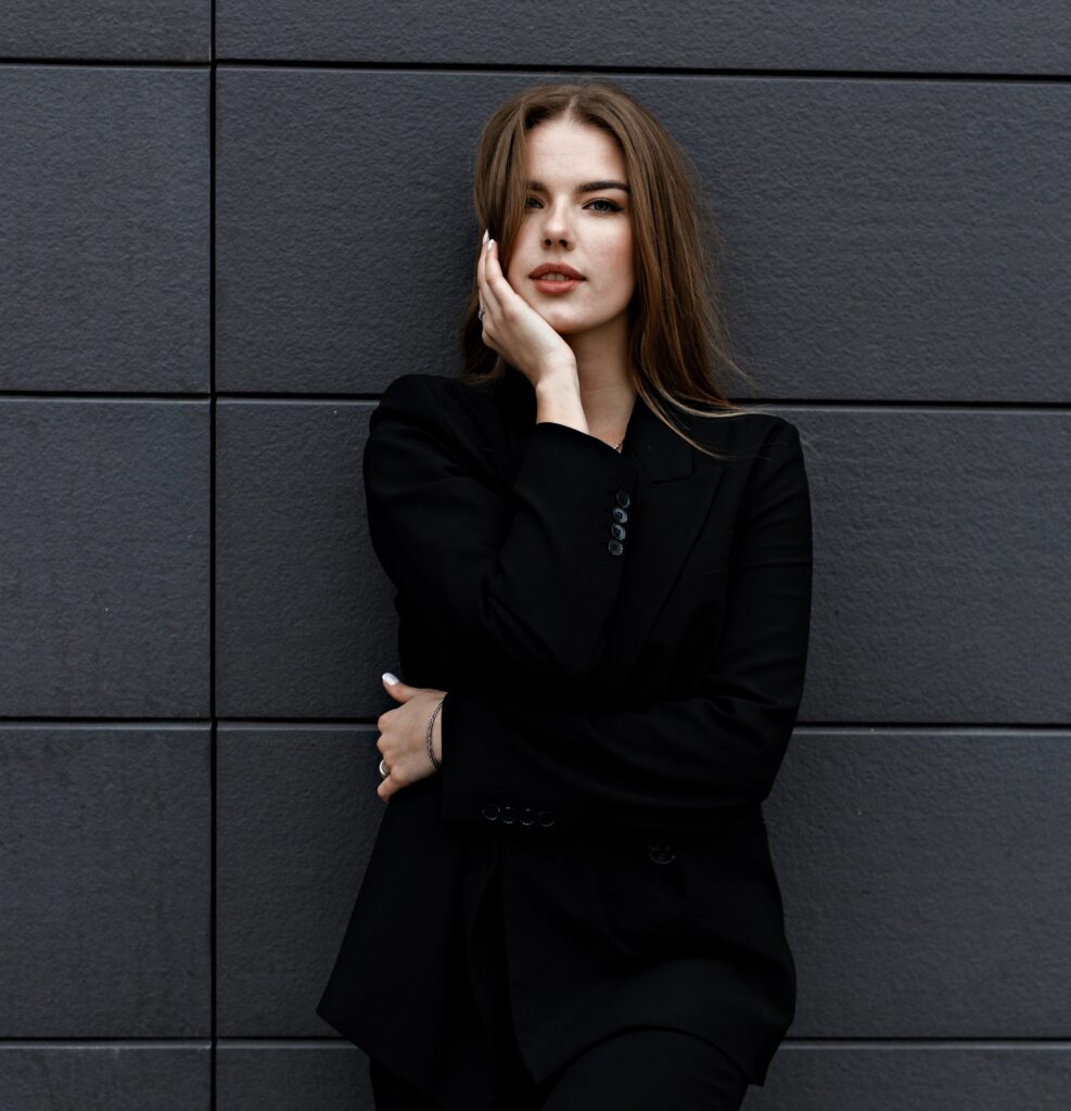
Black, a color that epitomizes sophistication, formality, and elegance, has a timeless quality that conveys a sense of mystery and authority. It is often used to create a sleek and polished look, making it a popular choice in fashion and luxury branding. The versatility of black allows it to adapt to various design contexts, from minimalist and modern to classic and traditional.
While black is often associated with positive attributes, it can also be linked to negativity and mourning in certain cultural contexts. Striking a balance in its use is crucial to harness its positive attributes without evoking unintended emotions. In design, black is often used to create contrast and highlight other colors, adding depth and visual interest to a composition.
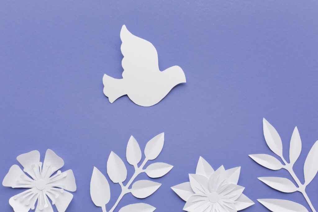
White:

White is a color that represents purity, simplicity, and cleanliness. It conveys a sense of innocence and neutrality. It is a popular choice in various design settings, from fashion to interiors, where a minimalist and modern aesthetic is desired. White is often related with cleanliness and is used to create spaces that feel open and airy.
In branding, white is frequently utilized to create a clean and uncluttered image. However, it’s important to note that cultural differences can influence the perception of white. Some associate it with mourning rather than purity. Understanding these cultural differences, it is essential when using white in a global context.
Brown:

Brown color is often linked to earthiness, stability, and reliability. It conveys a sense of warmth and comfort. It is a versatile color that can generate feelings of security and friendliness. In interior design, brown is often used to create spaces that feel cozy and inviting. In branding, brown is frequently employed to create a sense of dependability. It makes it a popular choice in industries where trust is important.
Color in Various Fields
Understanding color psychology is paramount in various industries, particularly in marketing, design, and branding. Businesses strategically leverage colors to evoke specific emotions and connect with their target audience on a subconscious level. For instance, fast-food chains often incorporate red and yellow to stimulate appetite and create a sense of urgency, aligning with the nature of their services.
Personal color preferences are influenced by numerous factors, including individual experiences, cultural backgrounds, and personality traits. An extroverted individual might gravitate towards bold and vibrant colors that align with their energetic personality, while someone more introverted may prefer softer and muted tones that resonate with their calm conduct.
The setting in which colors are used is supreme to their effectiveness. For instance, in the field of healthcare, calming and soothing colors are often employed in interiors to create a healing environment. In contrast, tech companies may choose for modern and energetic colors to convey innovation and dynamism.
Conclusion
In conclusion, color psychology is a captivating and dynamic field that delves into the intricate relationship between color and human psychology. While general associations exist, individual responses to color are highly subjective and influenced by personal experiences and cultural contexts. Whether in the realm of design, marketing, or daily life, a nuanced understanding of the psychological effects of colors empowers individuals and businesses to make intentional choices that resonate with emotions and perceptions. The rich tapestry of color psychology reveals the depth of human experience and the power that colors hold in shaping our perceptions and influencing our behaviors.
Interesting one
Great article